Logo

Case Study on Evolution of Filters

Analyzed and compared filter experiences across Highmark's healthcare applications to identify usability challenges and optimization opportunities. The case study evaluates multiple filtering paradigms, maps them to user workflows, and recommends a scalable filtering framework that improves efficiency, visibility of applied filters, and data exploration for insurance and healthcare users.

Image
User Persona
Dr. Emily Carter
Medical Reviewer
Tasked with reviewing patient records for compliance and quality. Prioritizes quick navigation, clear identification of relevant records, and minimal interruption to her review flow. Values speed and certainty in finding what she needs.
Image
User Persona
Mr. David Chen
Data Analyst
Conducts in-depth analysis of claim data, identifies trends, and generates reports. Needs to apply complex, multi-faceted filters precisely, review their aggregated impact, and iterate rapidly. Values clarity of applied criteria and parallel data viewing.
Image
User Persona
Ms. Sarah Jones
Claims Processor/Administrator
Frequently searches for specific claims, verifies statuses, or manages individual records. Benefits from straightforward, error-averse interactions and immediate feedback.

Popup Based Filters

image

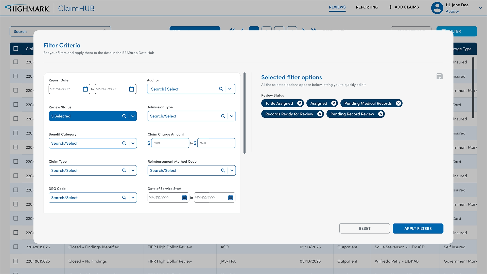
This design employs a large modal window titled "Filter Criteria" that overlays and darkens the entire background content (the table of claims data). All filter controls are consolidated within this modal's left panel, presenting various filter fields such as 'Report Date,' 'Reviewer,' 'Admission Type,' 'Benefit Category,' etc.

These fields use a mix of text inputs, date pickers, and searchable dropdowns, some with multi-select capabilities. A prominent "Selected filter options" panel on the right side of the modal explicitly lists all active filters as a series of distinct, easily removable tags. Users interact solely within this modal and must click an "Apply Filters" button at the bottom to close the modal and see the results reflected in the background data table.

Severe Context Switching and Reduced Data Visibility:

Problem:
The fundamental limitation of this modal approach is that it completely obstructs the underlying data table. Mr. David Chen, the Data Analyst, cannot observe the effect of his filter changes on the data in real-time. This forces a constant "apply-and-check" cycle, breaking his flow and burdening his short-term memory. He has to apply, close, assess the (potentially updated) table, then re-open the modal to make further adjustments.

Validation:
As per general UX heuristics, modal dialogs are disruptive. While they command focus, their use for iterative tasks where context from the underlying page is crucial significantly increases cognitive load and slows down the user, contradicting efficiency goals.


Higher Interaction Cost & Friction for Iteration:

Problem:
Each change to the filters requires an explicit "Apply Filters" click and the closing of the modal. This creates friction, especially for exploratory tasks. Ms. Sarah Jones might hesitate to experiment with different filter combinations if each attempt requires multiple clicks, waiting for the screen to refresh, and re-opening the modal. The lack of immediate feedback diminishes user confidence and flow.

Validation:
A low "time to value" is crucial in data-intensive applications. If the effort to apply and see filter results is high, users may underutilize the filtering capabilities or become frustrated.


Monopoly of Screen Real Estate During Filtering:

Problem:
While this design saves screen space on the main data view when no ilters are active, the moment a user decides to filter, the modal takes over 100% of their visual focus. This can be disruptive if the user needs to quickly reference an item in the data table (e.g., a claim ID) to inform their filter choices.

Validation:
Modals should ideally be used for tasks that genuinely require a complete interruption of workflow, like confirmations or crucial form submissions. Iterative data refinement generally benefits from persistent visibility of relevant context.

More Space Utilization:

This is a primary strength. The modal provides ample space to organize a large number of diverse filter options cleanly. Each field can have clear labels, descriptive text, and advanced controls (searchable dropdowns, multi-select, date pickers) without cluttering the main UI. This is excellent for complex platforms like ClaimHUB that have many attributes to filter by.


Clear Visibility of Selected Filters:

The "Selected filter options" panel on the right side is a highly valuable feature. It provides an explicit, consolidated list of all active criteria using clear tags that can be easily dismissed. This directly addresses the pain point of hidden filter states observed in the first approach and helps Mr. David Chen clearly understand the parameters of his complex query before applying.


Consolidated Action Buttons:

Having clear "Reset" and "Apply Filters" buttons at the bottom offers a well-defined commit point for the user, which can be reassuring for complex filtering operations.


Reusable for most use cases (Plug & Play)

Since the filter logic and UI are contained within a separate modal component, this design is highly portable and can be easily implemented across different tables, reports, or data views within Highmark applications, ensuring consistency.

Side Panel Based Filter

image

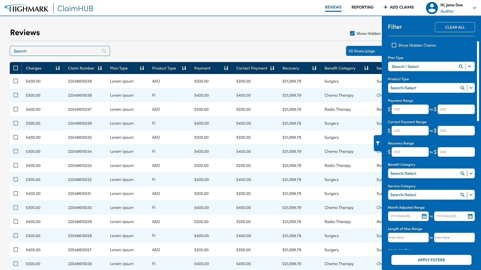
This design features a "Filter" panel that slides in from the right side of the screen, pushing the main data table content partially to the left, rather than fully overlaying it. The panel contains various filter options organized with clear headings and input types, similar to the modal approach.

Key features include checkboxes to "Show Hidden Claims," date range pickers, dropdowns for types, products, and categories, and numerical input fields for currency ranges. Notably, active filters are often visible as distinct elements (e.g., toggled checkboxes, populated input fields). Critically, the background data table remains visible and typically updates immediately as selections are made within the side panel, or upon a dedicated "Apply Filters" action.

Reduced Data Table Width:

Problem:
The side panel, while preserving vertical screen space for the data, inevitably shrinks the horizontal width of the primary data table. For Mr. David Chen, who might be comparing many data columns (e.g., Claim Type, Product Type, Payment, Recovery, Benefit Category), losing significant width could lead to excessive horizontal scrolling or truncating important information. This can impede side-by-side comparison, especially on smaller monitors.

Validation:
In information-dense tables, every pixel of horizontal space is valuable. While "view filtered data in parallel" is a win, if it comes at the cost of rendering key columns unreadable without scrolling, the net benefit might be reduced.


Potential for Disconnect in Feedback Loop:

Problem:
Although your note mentions "view filtered data in parallel," if the updates aren't immediate and still require an "Apply Filters" button (which is present in the screenshot), some of the advantage is lost. If an explicit apply is needed, the user still faces a mild delay, though it's less jarring than a full modal. Without immediate feedback, users might wonder if their selection had an effect before hitting 'Apply'.

Validation:
For complex forms with an "Apply" button, visual indicators that changes have been made (e.g., a "Pending Changes" badge or button becoming active) help reassure the user before committing.

View filtered data in parallel:

This is the strongest advantage of the side panel. Users can make a selection in the filter panel and immediately see how the background data table is affected (assuming immediate application). This enables powerful iterative filtering for Mr. David Chen. He can "explore" the data, quickly try different combinations, and instantly assess the impact without disrupting his context or breaking his flow.


View number of selected ones:

As filters are selected within the panel, their state is clearly visible (e.g., the toggled "Show Hidden Claims," populated text fields, selected dropdown options). This helps Dr. Emily Carter and Ms. Sarah Jones track their selections within the panel, enhancing confidence in their filtering process.


Good Balance of Screen Real Estate

This approach strikes an excellent compromise. It offers significantly more space for organizing filter options than the inline approach, avoiding clutter, while simultaneously preserving a large portion of the data table's visibility (unlike the modal).


Moderate speed to accomplish a filter

For users like Dr. Carter who might know their filter needs, accessing a concise side panel, making choices, and seeing results instantly offers a very efficient workflow. The "Apply Filters" is still there if they wish to batch changes.


Reusable for few use cases

The side panel pattern is flexible and can house many filter types. While the initial setup for each view needs customization, the pattern itself is highly reusable.


Clear Call to Action:

The "CLEAR ALL" button at the top right and the "APPLY FILTERS" button at the bottom provide clear interaction points.

Inline Controls with Dropdowns

image

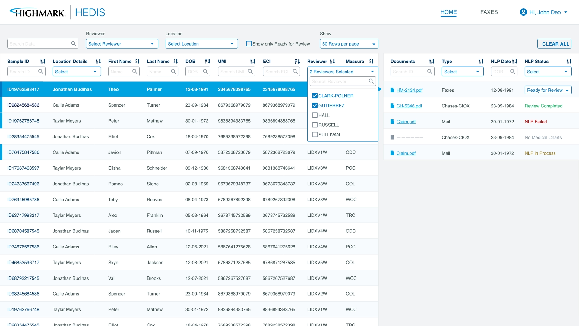
This design integrates filter input fields directly above the corresponding columns in the data table, serving as persistent inline filters. Users can type in search queries (e.g., for 'Reviewer' or 'Location'), select from pop-up dropdowns for pre-defined lists (like 'HLP Status' or 'Documents'), or utilize date range selectors.

For multi-select options (e.g., 'Reviewer' in the screenshot, showing a dropdown with multiple checkboxes like "CLARK FOLDEN", "GOLDSMITH", "HILL", "MCCALL"), the selected values are displayed within the dropdown only after opening it, with a summary number (e.g., "2 Reviews Selected") showing in the filter field itself. The data table updates immediately as filters are applied.

Cognitive Overload & Discovery Burden for Complex Datasets

Problem:
With up to 10-15 filter fields persistently present at the top, a user trying to find a specific record based on multiple criteria faces a cluttered interface. Identifying the correct field, discerning its interaction type (text input, dropdown, date picker, multi-select), and understanding its impact takes mental effort. This makes it challenging for a user like Ms. Sarah Jones to quickly initiate a search if they're not intimately familiar with each field.

Validation:
In visual design, dense interfaces can lead to "information fatigue." When every element competes for attention, users struggle to focus. While functional for single-field filtering, a plethora of inline fields quickly exceeds human cognitive processing limits for pattern recognition.


Lack of Persistent Clarity on All Applied Filters:

Problem:
While some multi-select fields show a count ("2 Reviews Selected"), the specific valueschosen are hidden behind another click. For single value selections or text inputs, there's no collective display of all active criteria anywhere on the screen. This makes it difficult for Dr. Emily Carter to quickly ascertain the current state of her filtering or to show a colleague the exact search criteria applied, increasing potential for error or redundant effort.

Validation:
UX principles emphasize "memory over recall." Forcing users to remember what they've selected in multiple hidden dropdowns or input fields creates an unnecessary memory burden, reducing efficiency and confidence.


Inefficient Iterative Refinement for Analytical Tasks:

Problem:
When building a multi-faceted search (e.g., specific reviewer and specific location and certain HLP statuses), users must interact with multiple separate dropdowns or input fields across the top row. If the results are not as expected, modifying a filter means re-opening that specific dropdown, potentially obscuring other filter inputs or the data table temporarily. This process becomes cumbersome for Mr. David Chen who needs to iterate rapidly and experiment with combinations.

Validation:
For exploratory data analysis, the interface should support an unbroken feedback loop. Dispersed filter controls make it harder to simultaneously adjust one filter while observing its relationship to another, hindering sophisticated data exploration.


Significant Vertical Screen Real Estate Consumption:

Problem:
This row of filters, though horizontally concise, permanently occupies valuable vertical screen space. In applications like HEDIS where viewing a maximum number of records (patient files) is critical for efficiency, this constant overhead can force more scrolling. On smaller monitors or for data tables with numerous rows, this directly impacts Dr. Carter's productivity by reducing her immediately viewable data.

Validation:
The primary content of the page (the data table) should receive visual priority. Auxiliary controls, while necessary, should be designed to either disappear when not in use or consume minimal valuable viewing space.

Fastest to accomplish a filter

A significant strength is the instantaneous update of the data table upon applying any filter. This direct feedback is highly intuitive, providing immediate confirmation of the filter's impact.


Column-Contextual Filtering:

Filters are logically positioned above their corresponding data columns, making it clear what data point each filter controls. This reduces ambiguity and helps users build a clear mental model of their search space.


Least Space Utilisation & Reusable for few use cases:

This pattern is excellent for applications where only a few, common, and always-relevant filters are needed. The horizontal density is low for simpler datasets.

Comparative Summary & Recommendations for Highmark Platforms:

For quick, single-axis filtering or highly specific column searches like an ID lookup where space is paramount Inline controls with Dropdown excels. Direct access and immediate, in-context updates. Ideal for Dr. Emily Carter when performing quick checks on familiar data points.

For complex filtering tasks requiring extensive filter options and a consolidated view of selected criteria, but where simultaneous data viewing is not critical (e.g., setting up a report template or a dashboard initial filter) Popup Based Filter provides a dedicated space for comprehensive filtering, with excellent management of active selections. This might be suitable for Mr. David Chen when setting up an initial, intricate report.

For iterative, exploratory data analysis where users need to apply multiple filters and immediately see their impact on the visible data (the most common and ideal scenario for daily operational tasks). Side Panel Based Filter offers the best balance of filter organization, clear state management, and real-time data visibility, empowering users like Mr. David Chen and Ms. Sarah Jones to refine their searches efficiently and confidently.

Next Work
Next Work
AI Recommendation
image